NewsTab — Overview
A three-week run of the full design process, exploring how to help college students become confident and informed news consumers.
Background and Goals
For our the Introduction to UI/UX Design course’s final project, we chose to tackle the prompt “Information and Trust in a Digital Democracy.” In the midst of a global pandemic with heightened political tensions, staying informed and identifying truths has become more and more difficult. Not only is there a barrage of daily headlines from all corners of the internet, but the information itself can be riddled with biases.
Every news source seems to be saying something different about each event, so how can readers arrive at their own informed conclusions?
Product
NewsTab is a web browser extension that delivers news in a digestible format through a medium already built into everyone’s daily routines: the new tab page. Through sentiment analysis and data visualization, NewsTab promotes critical thinking about the bias surrounding news as well as a user’s own consumption habits.
Time Frame
3 weeks
Team
Designers: Emma Kallman, Cindy Yuan
My Responsibilities
Leading user research, prototyping and testing, interaction details
Skills
• Survey design • User interviews • Behavioral personas • Empathy maps • Stakeholder mapping • Wireframing • Information architecture • Rapid grayscaling
• UI style guide • Remote usability testing • Rapid iterations
How do people interact with and feel about news?
User Research and Synthesis
Existing Literature Research and User Interviews
As we analyzed the prompt of “Information and Trust in a Digital Democracy,” we chose to focus on journalism as a platform for this information. Before jumping into user interviews, I first looked at existing literature on how people consume news, in order to base our user interviews in a proven framework.
From recent studies, we gleaned these main insights:
News has high redundancy, so people will feel informed from just reading headlines.
Readers can be grouped into four general interests: civics, socio-humanitarian, culture, and political depth.
The main factor of reading an article is relevance.
Individuals aged 30 or younger overwhelmingly get their news online.
Using these findings, we then conducted remote user interviews for a deep dive into consumption habits and viewpoints on news.
Our 30 minute interview guide focused on:
General background information: We highlighted area of study, political affiliation, and geographical location as information that may affect thoughts and experiences with news.
Personal experience with news consumption: We asked people to describe their news consumption habits, why they read the news, and how informed they feel.
Attitudes towards news entities: We delved into how people chose their news sources and what makes a source “trustworthy” or “untrustworthy.”
Research Synthesis
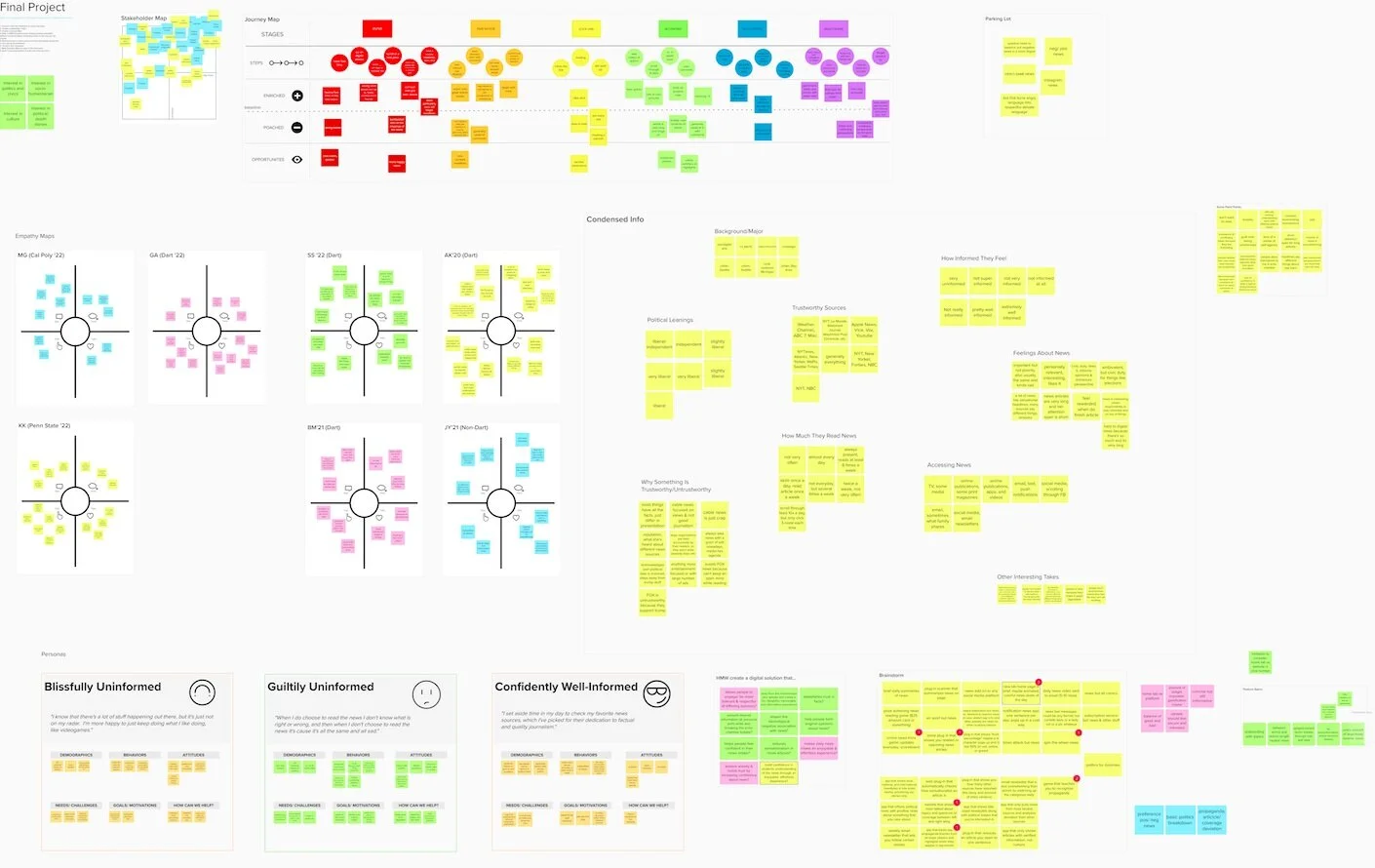
We synthesized our results through many methods: stakeholder mapping, user journey, empathy maps, cluster visualization, and behavioral personas.
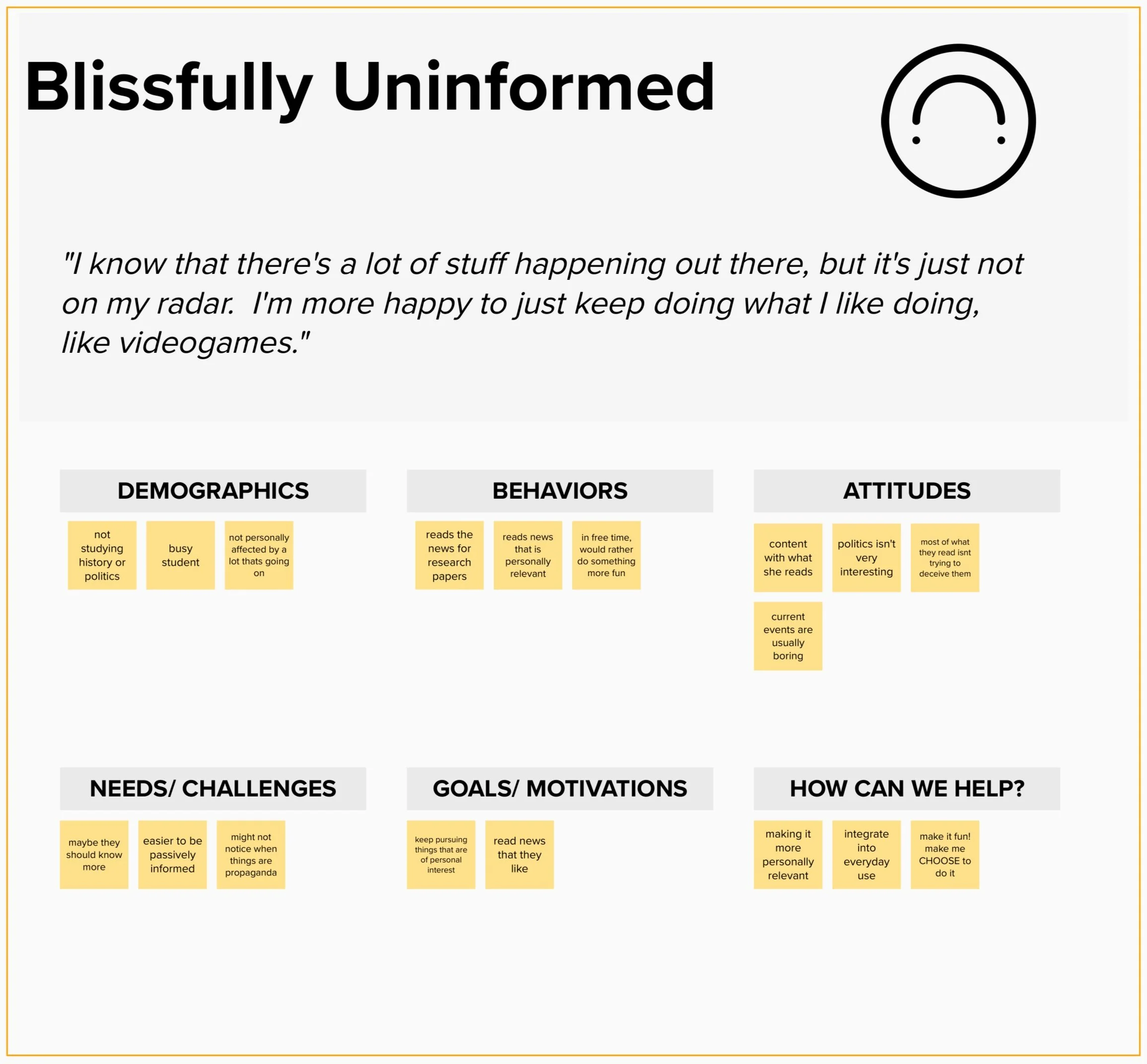
Our behavioral personas were especially helpful. Our interviewees could be grouped into “Blissfully Uninformed,” “Guiltily Uninformed,” or “Confidently Informed” based on their news consumption habits and attitudes.
For our product, we chose to focus on the “Guiltily Uninformed” persona.
We found that a “Guiltily Uninformed” individual…
Feels overwhelmed by the fast pace and large volume of news — it’s impossible to read it all.
Passively reads the news through social media or is unsure of what is right or wrong in the news that they do read.
Lacks confidence in their own ability to stay informed, but feels that they should be informed, whether for civic duty or to keep up with friends.
We asked ourselves,
How might we build confidence in students’ understanding of the news through an enjoyable, effortless experience?
Competitive Analysis
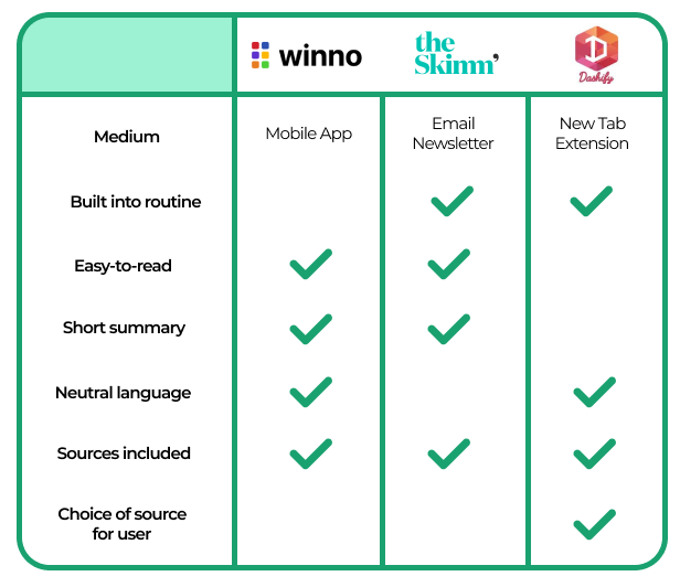
We took a look at products that aim to make news easier to read and digest, breaking down their advantages and shortcomings.
As we moved into brainstorming, our product goals were to:
Help people think more critically about bias in news.
Present digestible and reasonably paced news.
Instill confidence through the information we deliver.
How might we build confidence in students’ understanding of the news through an enjoyable, effortless experience?
Brainstorming core product features
Through brainstorming and checking back in with our users, we came up with several important initial features:
Discovery of Sentiment Analysis through further user research
Our interviewees didn’t care for fact-checking or political bias charts, because they already knew the general bias of their sources and because fact-checking websites are plentiful on the internet.
However, they were interested in knowing article variance across different sources for a holistic understanding of how controversial stories might be.
We found that sentiment analysis algorithms exist and have been applied to news articles, and we wanted to use it to promote critical thinking of news bias in our product.
Exploring the “New Tab Extension” medium
Our target user’s passive news consumption habits meant that a website or mobile app wouldn’t be ideal, so we looked to a platform already incorporated in everyone’s daily lives.
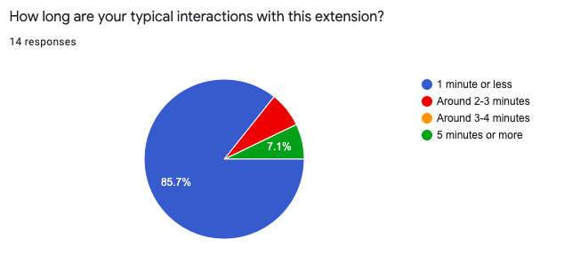
To make sure this was the right platform for us, I designed and distributed a survey to better understand how people interact with new tabs.
From 40 responses, we concluded that :
People would be open to a new tab extension focused on News
Content had to take minimal time to digest.
Delight and Personalization
Rewards System:
In order to bring an element of delight and to encourage news reading behavior, we outlined a badge system that would give the user badges for reading more articles.
Featured and Personalized Topics:
In order to fight against an echo chamber but still keep news stories personally relevant, we chose to embrace a mix of featured top news articles and topics selected by the user.
Presenting complex information through simple and clear design.
Grayscaling, Information Architecture, and Style Guide
Sketches and Grayscales
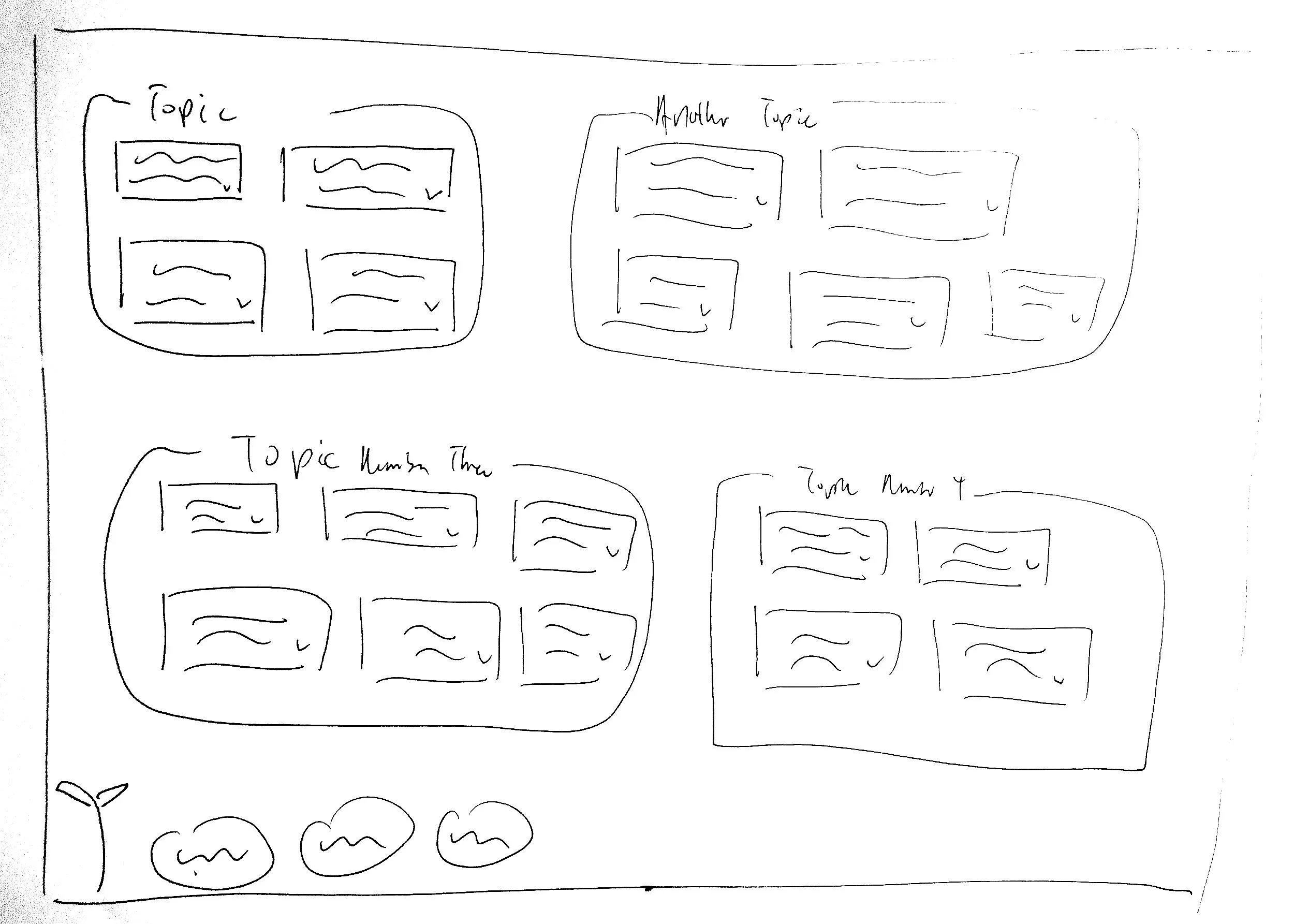
We went through initial paper sketches to translate this idea into web screens. Then, we iterated with low-fidelity grayscales to explore different modes of presentation.
Information Architecture and High Fidelity Grayscales
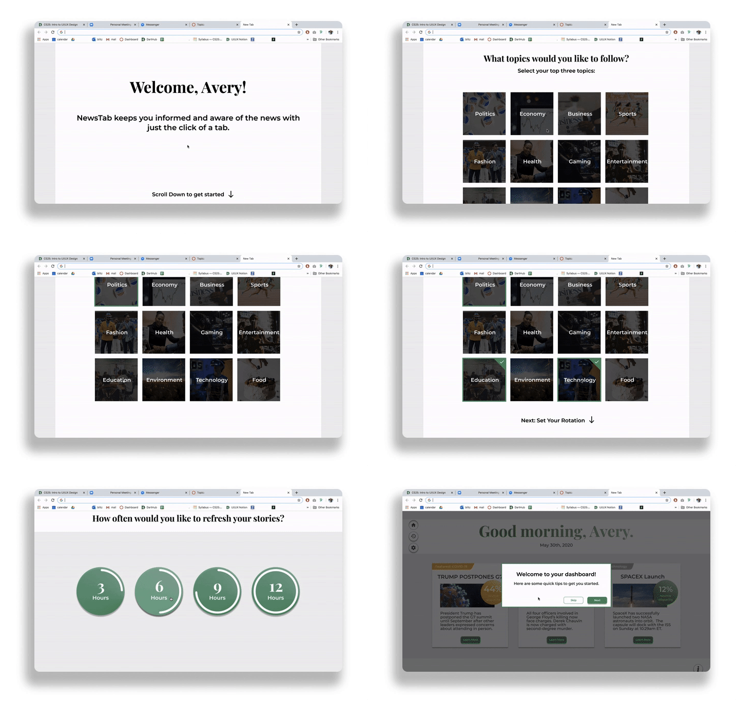
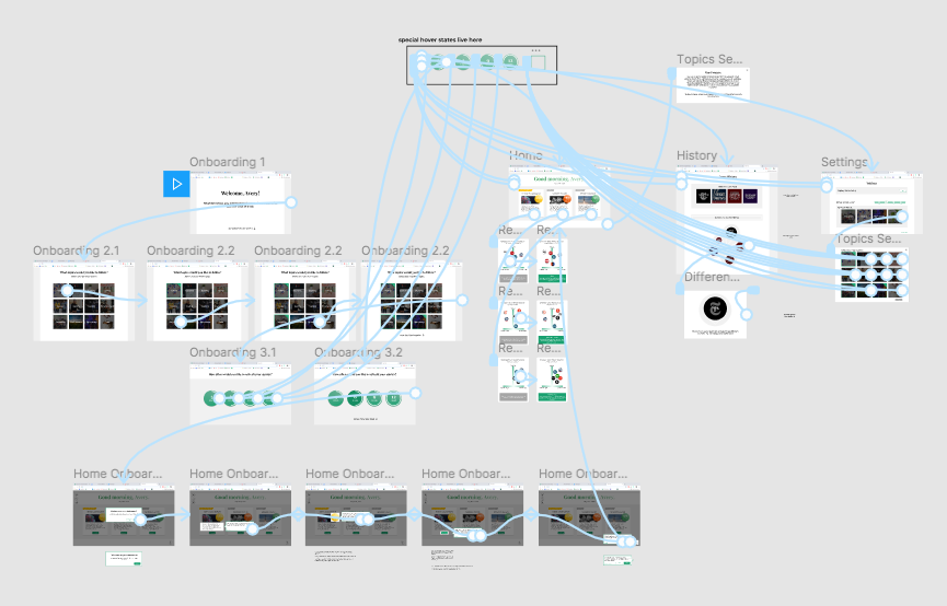
Once we settled on our primary wireframes, we laid out our information architecture. In order to convince users to spend time reading the news between their other tasks, we prioritized keeping our screens extremely shallow and simple. Iterating on this flow helped us minimize clicks and avoid feature creep.
An earlier iteration.
A later iteration where every main feature could be reached in one click.
As we moved into high fidelity grayscales, our flows informed the amount of detail or content to put into each component. Our high fidelity grayscales were focused on building out UX hierarchy, interaction details, and content, including the user onboarding process.
A Sharp, Professional, and Minimal Style
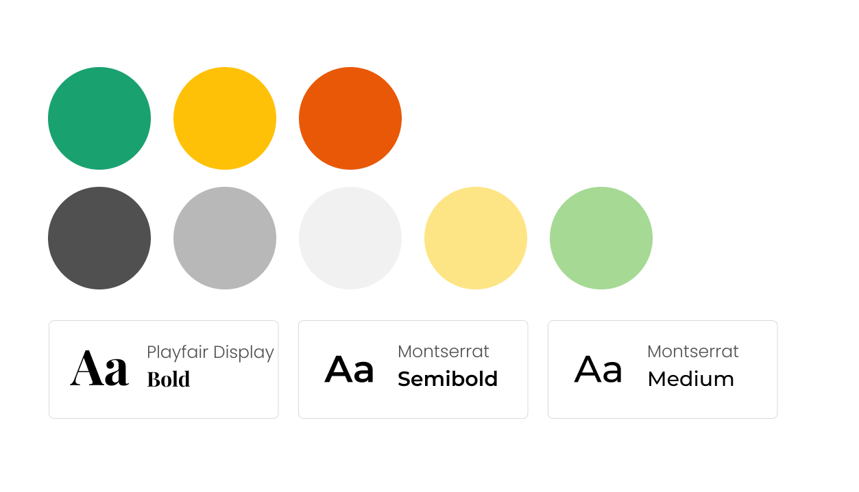
Through several iterations, we settled on a sharp, professional, and minimal style guide.
Colors:
Neutral colors — for a clean environment to complement article photos.
Green — as a non-political and calming action color.
Stoplight color scheme — for source disparity buttons, to reinforce number percentages as low, medium, or high.
Type:
Playfair Display — serif header font that screams “News” and signals trust.
Montserrat — sans serif font that is modern, but not too serious.
Readability — font weights of medium or above for easy scanning.
Introducing NewsTab’s Core Features
Our Product
As we sought out feedback from mentors and conducted usability tests, we arrived at final iterations for our three core features:
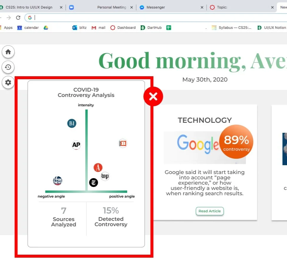
News Cards: Neutral, digestible news “bites”
Three news cards per rotation reduces choice overload in the user.
A small topic tag and a short story headline allows for quick scanning.
Image and “Source Disparity” bubble offer visual signals of article contents and how controversial this story may be.
Written blurb uses neutral language and is less than 30 words in length.
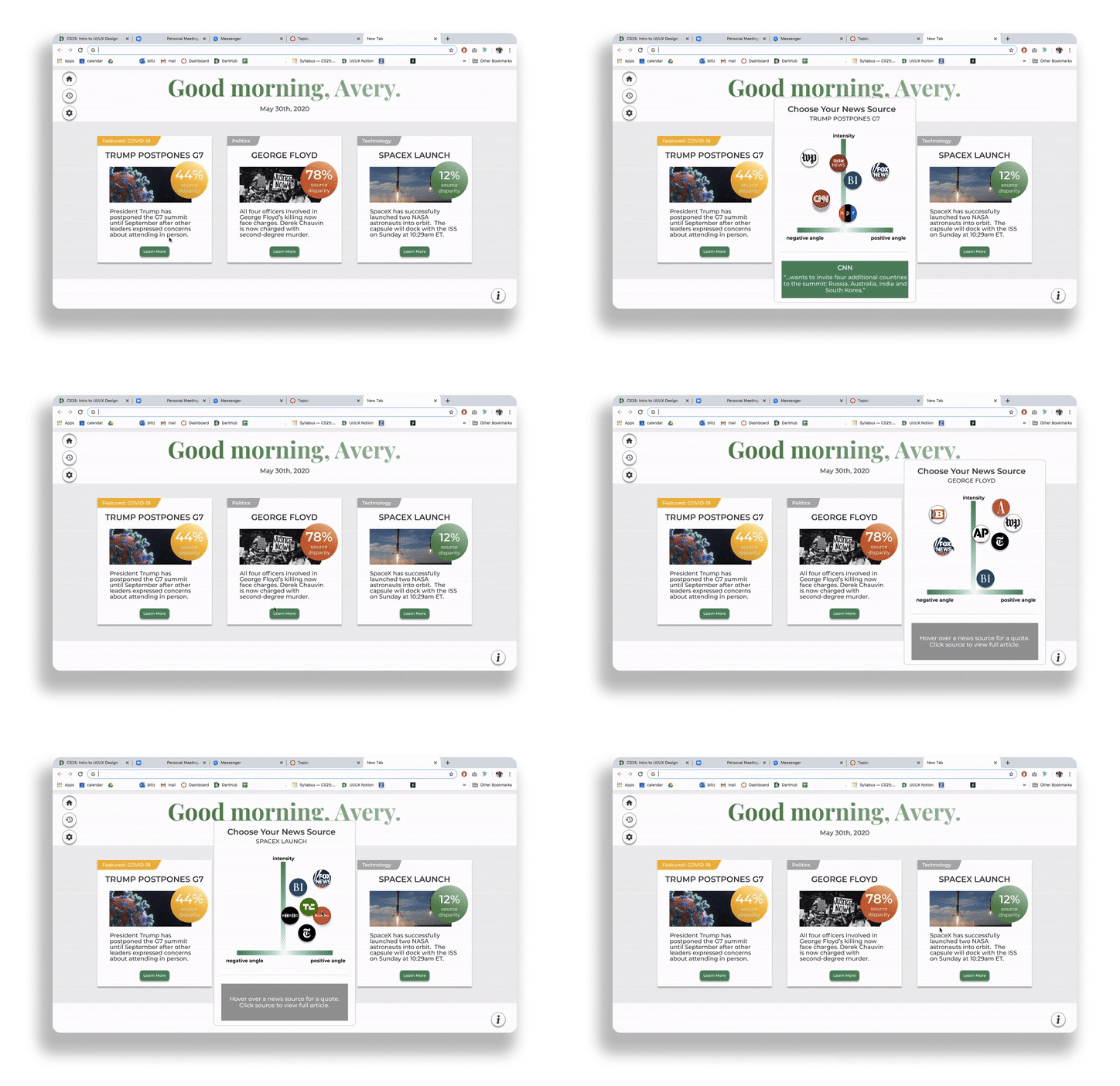
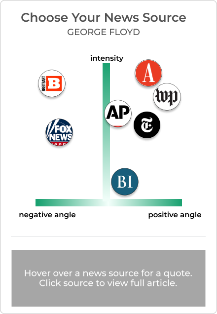
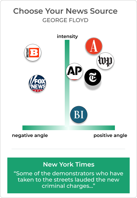
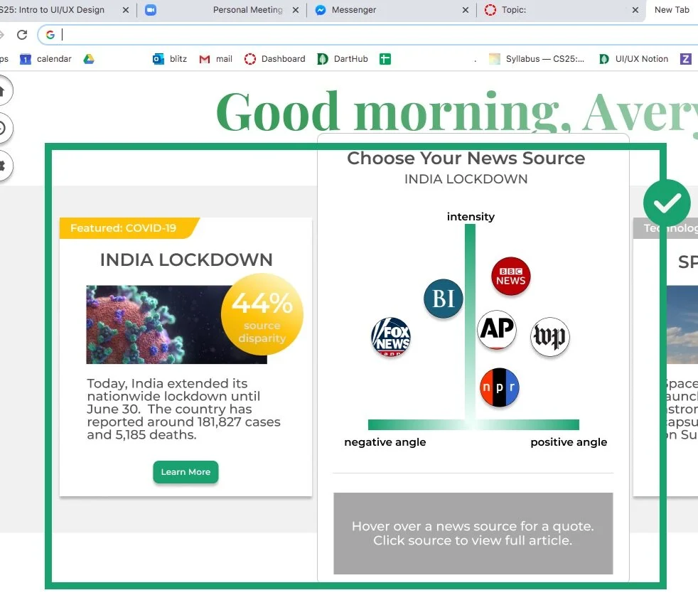
News Source Charts: Mapping source bias
Sentiment analysis breakdown for this story, by source.
Top news sources are mapped against positive/negative language and overall tone intensity.
Hovering over a source previews this source’s tone and adds context to the graph position.
Users can click the source to open the full-length article of their choice.
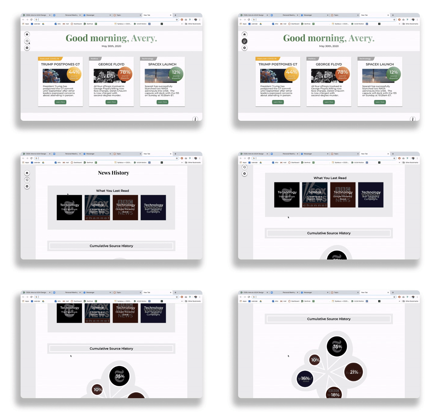
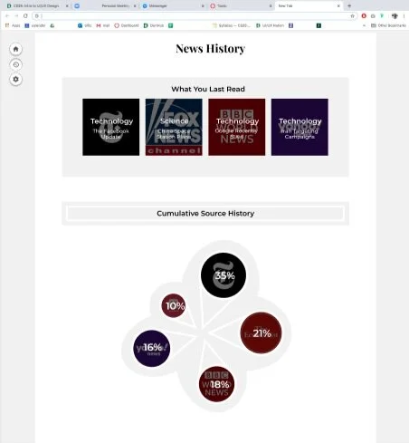
News History Tab: Reflecting on reading habits
Replaces the rewards system, to encourage reflection instead of accumulation.
Quick links to last opened full-length articles.
Cumulative source chart shows which sources the user favors.
If a user always reads one source, we show a nudge to encourage exploring more sources.
How effective are our designs in promoting critical thinking about news bias?
Usability Testing and Iterations
Prototyping
In order to fine tune our features for wording, clarity, and cohesion, we prototyped our screens with partial hover states and animations, running user testing sessions with six college students.
We tested for understanding throughout the entire prototype, with special attention to how people interpreted the news sources chart.
Rapid Iterations and Major Changes
We iterated as we continued user testing, so that we could also see if ideas we had to address previous confusion would work out.
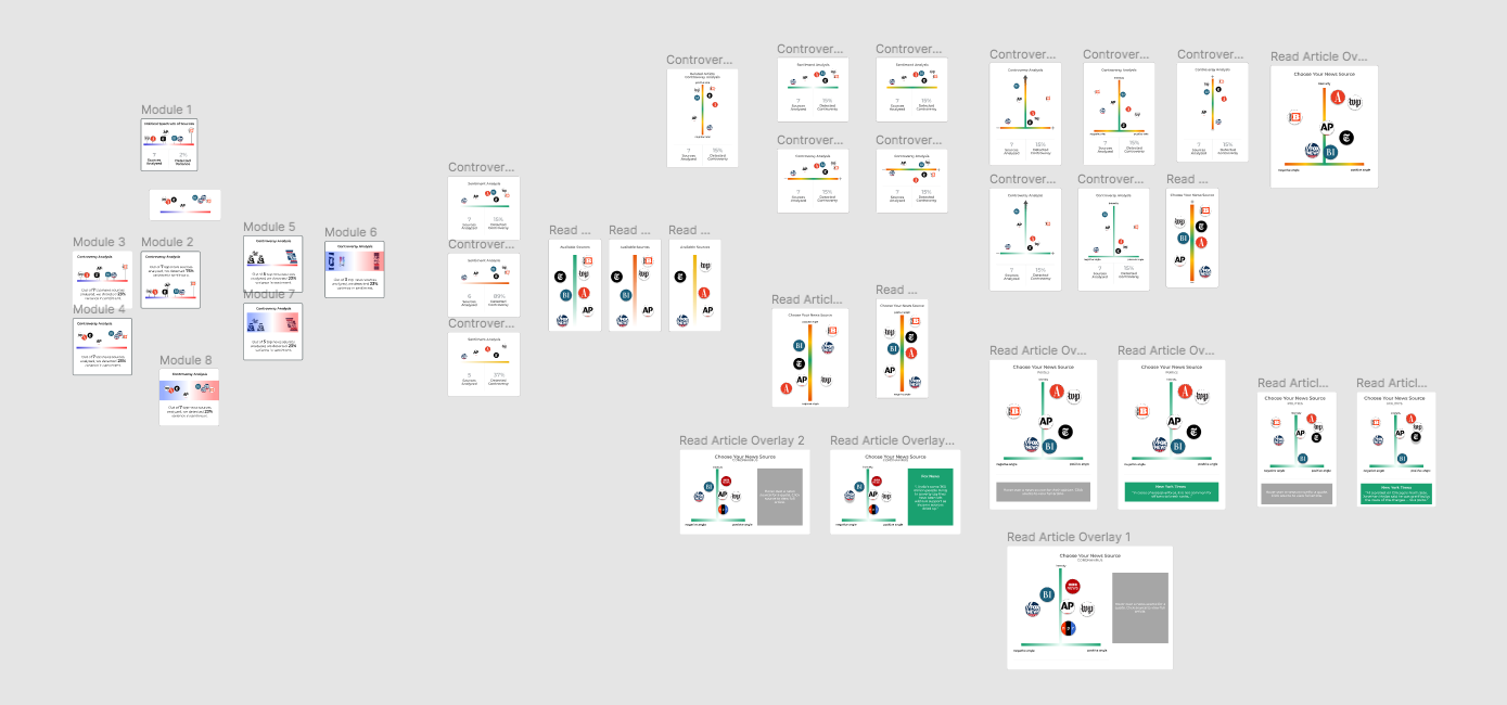
The news source chart went through 21 different iterations over the course of the project, with 7 user tested iterations.
Shrinking topics and adding a headline for increased reader comprehension
100% of first version participants focused on the topic instead of the story content.
We learned that our topic tag was where they expected a headline to be, and it was too general to offer context clues.
After shrinking the topic tag and adding a headline, 100% of participants better understood story content.
Adjusting chart placement and adding quote preview to better convey source disparity
100% of first version participants were unsure of the news source chart meaning.
We hypothesized that adding a quote would offer more context, allowing them to compare articles without committing to opening a full piece.
4 out of 5 participants clicked rapidly between story blurb and news source chart, indicating a need to see both at once.
After adding quote previews and placing the chart adjacent to the story, 3 out of 4 participants correctly interpreted the chart.
The future of NewsTab, and looking back on an intensive, three-week design journey.
Next Steps and Reflection
Next Steps
As this was a barely three-week long project, there are many features that we would like to iterate on for next steps. The News Source Chart in particular needs work — despite our numerous iterations, it is still difficult to nail the right wording.
My Takeaways
This project’s main challenges were:
Designing under time pressure — With only three weeks, we had to work efficiently. I spearheaded thorough, fast-paced user research to uncover clear user needs, enabling us to make design decisions quickly based on vetted insights.
Visually communicating language bias — Communicating a language bias spectrum without connecting it to political bias proved to be a tough challenge. Between our own thoughts and user feedback, we made 21 unique iterations of this feature.
Constraints of a new tab extension — Our medium of choice also limited our design: users would not want to be inconvenienced by their new tabs; we had to convey complex information through simple and clear screens.
As I stepped into a leadership role for user experience, it felt natural to switch around methods to better fit our unique situation, helping us gain important insights. When we felt unsure about direction, revisiting our user insights got us back on track.
This project helped me feel more confident in applying design methods with intent and was reflective of the visual and interactive design principles I had improved on through this class.


